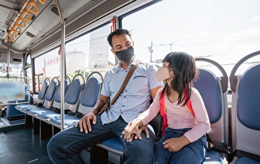
Effective public engagement for transit planning needs to involve community members from the very beginning. Technologies such as Zoom that gained wider use during the pandemic have made participation possible for many more people—especially underrepresented groups.
In a recent project, U of M researchers developed a toolkit for use by community members, transit planners, and municipal works staff. “With this toolkit, we’re not only providing tools for more robust community engagement—we’re also equipping both community members and transit planners to assess the equity and accessibility issues related to planned transitways,” says Professor Tom Fisher of the Minnesota Design Center, the project’s principal investigator.
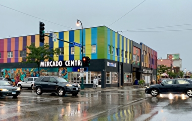
The toolkit was one outcome of a two-phased project. In the first phase, researchers analyzed the accessibility of station areas along three planned transitways in the Twin Cities area. (This phase was part of a broader accessibility analysis of the lines.) They also looked at public works improvements that might improve safety, security, and accessibility for transit users, especially those populations who are most transit dependent.
In the second phase, the research team evaluated 56 digital platforms for possible use in transitway community engagement. “While each platform was found to have strengths and weaknesses, all allow for a greater diversity of participants than traditional in-person meetings,” he says. (The evaluation is available in a searchable spreadsheet.)
Combining findings from the two phases, researchers developed the toolkit—a set of flexible tools that work independently of, but also complement, each other. The tools allow people to evaluate and score the options available to them, comment on existing and proposed conditions, and visualize what different alternatives might look and feel like once realized.
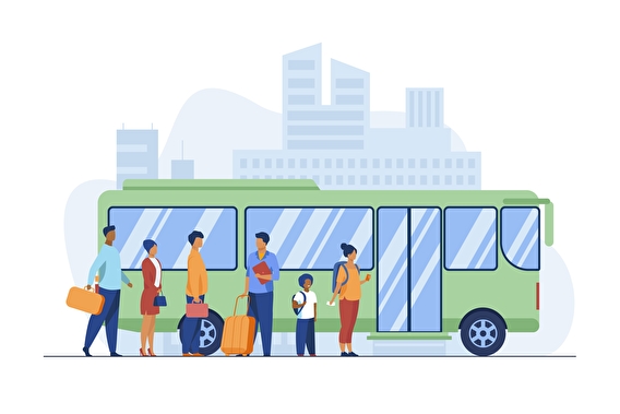
The tools apply to any type of transit in any location. They work remotely and in person, on digital platforms and in print, and asynchronously and synchronously.
To ensure equitable access, the tools use common words, photographs, and icons to help those who may have little or no experience with transit planning understand concepts and convey their ideas and concerns. The photographs and icons may also help people who have difficulty reading maps or who may not speak or read English.
The project was funded by Transitway Impacts Research Program. The toolkit team included Joseph Hang (design and research fellow) and Dan Ogranovich and Lynda Chao (graduate students) of the Minnesota Design Center.
The five tools in the toolkit
Transit and Urban Design Flashcards: This set of 20 flashcards describes the physical features related to transitways and urban design more generally. The flashcards ensure that everyone has the same basic understanding of the terms being used and ideas being discussed. Each category is represented by a visual icon that is then used in the other tools.
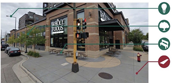
Station Area Mapping: This tool locates transit station stops on a GIS map and draws a quarter-mile circle around each one. Based on this mapping, the tool uses Google Streetview images and the icons from the new flashcards to highlight what exists—or doesn’t exist—along the routes to key destinations.
Experiential Mapping: In face-to-face community meetings, people often mark maps and make notes about their everyday experiences. Digital tools now allow that same kind of annotation. The icons from the flashcards provide a quick way for people to raise an issue or identify a problem worth discussing.
Station Evaluation: This tool lets people rate a proposed station area on a three-point scale. The tool uses 11 categories (such as street lighting) related to those in the flashcards.
3-D Visualization: This tool allows users to turn a layer on or off to show what a particular improvement might look like in a particular setting. The tool uses the icons developed for the flashcards to indicate what each layer might show.