In real estate, location is everything. But in determining how useful a public transit system is, the location of bus and train stops isn’t the only factor—a line will have limited usefulness if it runs infrequently or doesn’t connect to other parts of the transit system.
To better study this relationship, researchers from the U’s Global Transit Innovations (GTI) program have designed an app that compiles and maps data on transit service frequency. The app contains service frequency data for a total of 42,173 routes and 973,356 stops in 50 countries.
“If we just look at where transit routes and stops go, it’s deceiving to a certain point,” says Yingling Fan, professor at the Humphrey School of Public Affairs and principal investigator of the project. “Some of those routes and stops do not provide any service during the weekends and are very infrequent.”
To better visualize where transit vehicles stop, how often they stop, and how far a person can travel on them, the researchers designed the Service Frequency App—a website where users can view interactive maps of route and schedule data from transit agencies all over the world. It is useful for both the public, who can use it to find homes and jobs with transit access, and for researchers and practitioners, who can analyze the data and help design better transit systems.
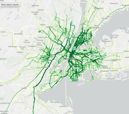
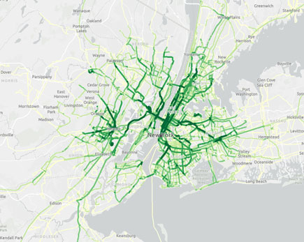
Upon entering the main portal, users are shown a global map that displays the locations of transit providers in different cities. Blue rectangles box out the “service extent” of each provider. Up close, transit routes are marked out in shades of green based on stop frequency. The more often a bus, train, or other transit vehicle stops along a certain route, the darker the shade of green.
Users—particularly researchers—have the option to download the data that inform the maps. Originally, the U of M researchers gathered the data from a site called TransitFeeds, which formats the data as text files. For the app, the researchers compiled the data so that they can be viewed as a whole, which makes it easier to compare to other factors such as distribution equity.
“You potentially can overlay population distribution on top of the map,” Fan says, “and then see, for example, whether specific population groups actually have lower transit access.”
Eric Lind, research and analytics manager at Metro Transit, says the app provides a good summary of one layer of the transit system. This can be combined with other data for a more complete understanding of transit usefulness, which can help planners make decisions. “For me it’s more of a question-generating tool, which can be very useful,” Lind says. “It will tell you [at a minimum] the potential for someone who can access that stop to get somewhere else.”
Researchers have finished processing the data, and the app is available for public use. Fan says she aims to update the data on a yearly basis and continue adding features that make the app more user-friendly.
The app, a user guide, and the methodology report can be accessed on the GTI website.


